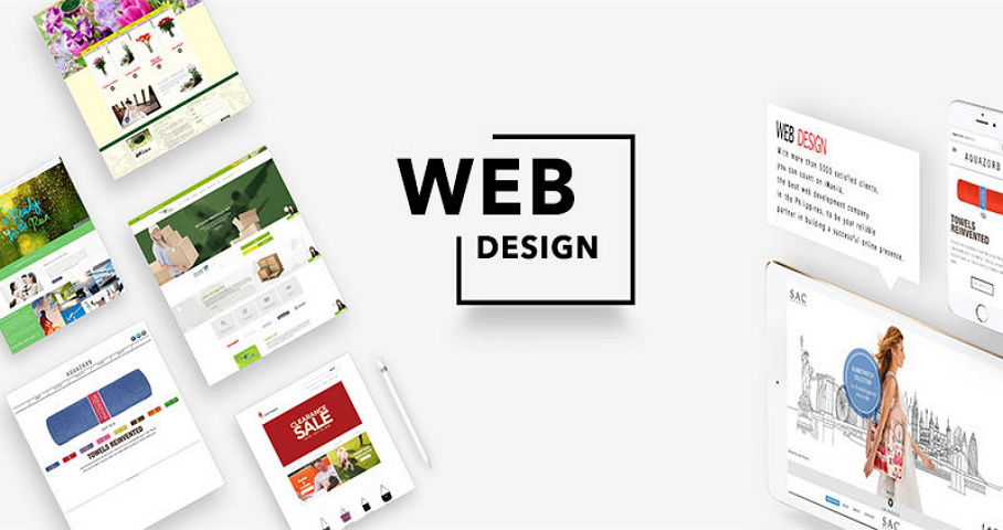
Web design is not merely about creating visually appealing websites; it also involves understanding human psychology and how color and layout choices can significantly influence user behavior. The careful selection of colors and layouts can impact a user’s emotions, decisions, and overall experience on a website. Color psychology plays a crucial role in web design. Different colors evoke different emotions and can have a profound impact on how users perceive and interact with a website. For example, warm colors like red and orange can create a sense of urgency and excitement, making them suitable for call-to-action buttons or limited-time offers. On the other hand, cool colors like blue and green are associated with calmness and trust, making them ideal for conveying reliability and professionalism. The color scheme of a website should also consider cultural and demographic factors. For instance, in some cultures, white represents purity and simplicity, while in others, it symbolizes mourning.
Understanding the cultural context of your target audience is essential to choosing the right colors that resonate with them. Layout design is equally important when it comes to influencing user behavior. A well-structured layout can guide users through a website and encourage them to take specific actions. Here are some key layout elements that can influence user behavior:
F-Pattern Layout: Studies have shown that users tend to read content in an F-shaped pattern, focusing on the top and left side of a page. Placing essential information and calls to action in these areas can improve user engagement.

Whitespace: Adequate whitespace between elements can enhance readability and make a website feel less cluttered. It helps users focus on the content that matters most, reducing distractions and improving their overall experience.
Grid Layouts: Grid-based layouts create a sense of order and consistency. They help organize content and make it easier for users to scan and find what they are looking for.
Responsive Design: With the increasing use of mobile devices, responsive design is crucial. A layout that adapts seamlessly to different screen sizes ensures a positive user experience across various devices.
Hierarchy of Information: Using a clear hierarchy of headings, subheadings, and bullet points can make content more scan able and digestible. Users can quickly identify the most relevant information.
Visual Cues: Arrows, icons, and images can be used as visual cues to direct users’ attention towards specific elements or actions. For example, an arrow pointing to a Sign Up button can encourage users to take that action.
In conclusion, web design is not just about aesthetics; it is about understanding the psychology of color and layout to influence user behavior effectively. By choosing the right colors that resonate with your target audience and designing a user-friendly layout, you can create a website that not only looks good but also drives desired actions and engagement. Ultimately, a well-thought-out web design can lead to higher conversion rates, increased user satisfaction, and a more successful online presence.

